 Greenridge
 How the kit informs the product
Greenridge is a field app: clipboard truth, map pins, and honest freshness. This page documents the CSS token layer (colors, type scale, spacing, radii) and the semantic patterns that ship in the PWA—so design decisions stay traceable to code. It is a standalone reference: the consumer marketing site and in-app navigation do not link here.
Interactive design kit — browse foundations, atoms, molecules, and organisms in the browser (same UI as
npm run stories in the repo).
Time-of-day phases
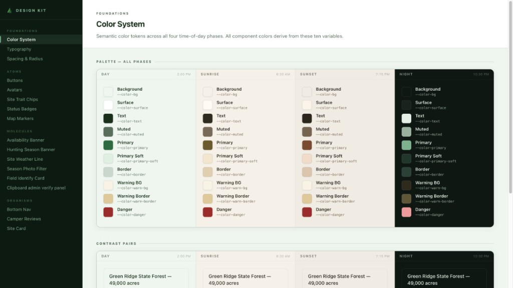
The app mirrors sky state with data-theme-phase on :root. Each phase remaps the same semantic variables
(--color-bg, --color-primary, …) so components do not fork—only tokens change. That is how sunset warmth reaches
the map chrome and sheet rows without one-off hex in components.
Day
Default field read; mint wash, deep green primary.
Sunrise
Cooler forest floor; amber primary for early light.
Sunset
Warm paper tones; russet primary.
Night
True dark: near-black surfaces, green kept only as accent. Text on a filled primary flips to dark ink via --color-on-primary, because white on the night sage is 2.2:1.
Watch it move
The cards above are the four palettes at rest. What a camper notices is the change, so this runs the real one: the same 700 ms colour-only cross-fade the app applies, added for the length of a shift and taken off again. Drag the sun below the horizon and the chrome follows.
Open · last read from the clipboard 2 hours ago
Which phase you get
The phase follows the sun’s actual altitude at the park’s anchor — the same
sunPosition() the night-sky pages and the 3D map read — not the device’s appearance setting.
Above +1° is day; below −0.83°, the geometric horizon once refraction
and the sun’s own width are allowed for, is night; the band between is sunrise or sunset depending on which
side of south the sun sits. It was a table of four seasons with fixed wall-clock windows until it was not:
“summer” runs June to August, so in late August the app sat in sunset chrome until 21:45 when the sun
had set at 19:57.
The band is one degree wide on purpose. The sun descends 0.213–0.244° a minute here, near enough constant across the year, so a degree is about eight minutes — some sixteen minutes of colour in a day. The forest’s colour is green; the gold belongs to the few minutes the sun is on the horizon, not to the whole evening.
Changes cross-fade over 700 ms, colour only — background, border, text, fill — so
nothing competes with a scroll or an animation already running. The transition is put on the document for the
length of one shift and taken off again rather than left standing on every element, and it snaps under
prefers-reduced-motion. Nothing polls for it either: the app computes when the phase next differs
and sleeps until then, four wake-ups a day rather than 1,440.
prefers-color-scheme is deliberately not consulted: a phone left in dark mode all year would never once
see the forest’s daylight, and the two settings answer different questions — the OS asks how you like screens,
this asks what time it is where you are going. It applies signed out, read from localStorage before React mounts.
Campers can override it in Preferences → Appearance: Automatic (the default, above),
Light pinned to day, or Dark pinned to night. Pinning is absolute rather
than nearest-phase, so a theme chosen at three o’clock is the same theme at four.
Night vision — the red-on-black mode — rides on top and is decided by the real hour, not by the drawn phase. It protects dark adaptation at a dark campsite, which is a fact about the world rather than a preference, so pinning Dark at noon gives a dark screen and not a red one.
Chrome is part of the palette
The header and bottom bar carry their own gradients (--app-header-grad-*, --chrome-grad-*) rather than
reading --color-surface. That is why night reads as genuinely black rather than dark grey, and it is the part most
easily forgotten: remap the semantic set alone and the chrome stays mint at midnight.
Structure tokens
Spacing uses a 4px / 8pt grid (--space-1 … --space-12), with semantic aliases (--gap-section,
--padding-card) so layout stays consistent between map overlays, site cards, and modals. Radii are stepped (--radius-sm …
--radius-chip) so chips read as chips and sheets read as sheets.
Spacing scale (excerpt)
Radius scale
Type scale (semantic)
| Token | Use in product |
|---|---|
--text-micro | Map legend pills, AQI label—dense but legible. |
--text-menu | Bottom nav labels; must stay clear at arm’s length. |
--text-title-md | Sheet section headers, modal titles. |
--text-display | Weather temperature, hero numerals—short strings only. |
Availability language
Clipboard-derived freshness is uncertain by nature. The kit defines three semantic lanes—fresh, stale, warn—so map badges, site rows, and banners agree. Product copy never promises a reservation; it describes what campers last saw.
Where it shows up
- Map & pins — primary green for affordances; muted text for secondary trail copy.
- Sites list & filters — surface vs background contrast from
--color-surface/--color-bg; section rhythm from--gap-section. - Clipboard upload & parse — stale sheet chrome uses
--color-avail-stale-bg/--color-avail-stale-border/--color-avail-stale-text; generic warn callouts use--color-warn-bg. - Bottom nav & touch —
--size-touch-min(44px floor) and input font-size floor to avoid iOS zoom traps.
Source of truth
Production tokens live in web/src/index.css (:root and [data-theme-phase]). Storybook-style panels for side-by-side
phase review use web/stories/themes.css with .theme-panel.theme-* classes. Foundations stories are under web/stories/stories/foundations.tsx.
This reference page is deployed at /greenridge-design-kit/; the explorable UI lives at /greenridge-design-kit/app/
(Vite app from web/stories). Neither is linked from the marketing homepage or in-app shell by default.