UX & design kit
Lightweight kit — curated explorer, themes side by side. Storybook workshop — every component and state (night and auth toolbars included). Both import production components so the explorer can’t drift from the app.
Product design · ownership · shipping
Green Ridge State Forest campsites are first-come, first-served — managed at a physical signup sheet during limited hours at headquarters. This case study documents how the app mirrors that board with visible freshness, honest unknown states, human review, a production-linked design system (interactive kit + Storybook), and a publish loop that reaches the PWA and Capacitor iOS shell together — proven with Claude in Chrome as a browser QA agent.
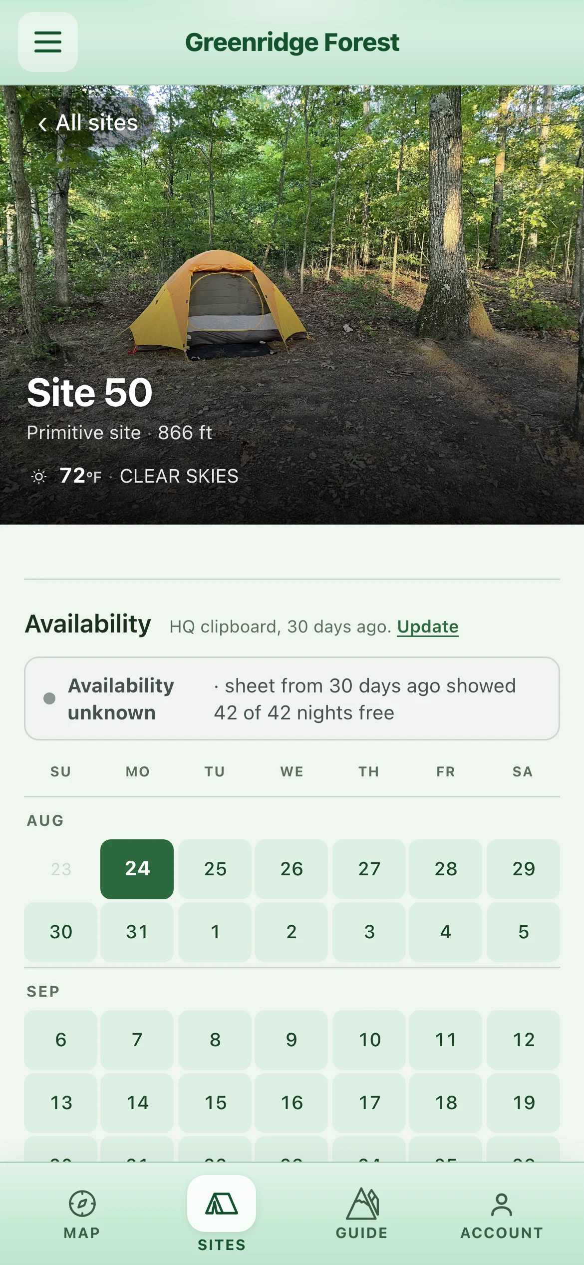
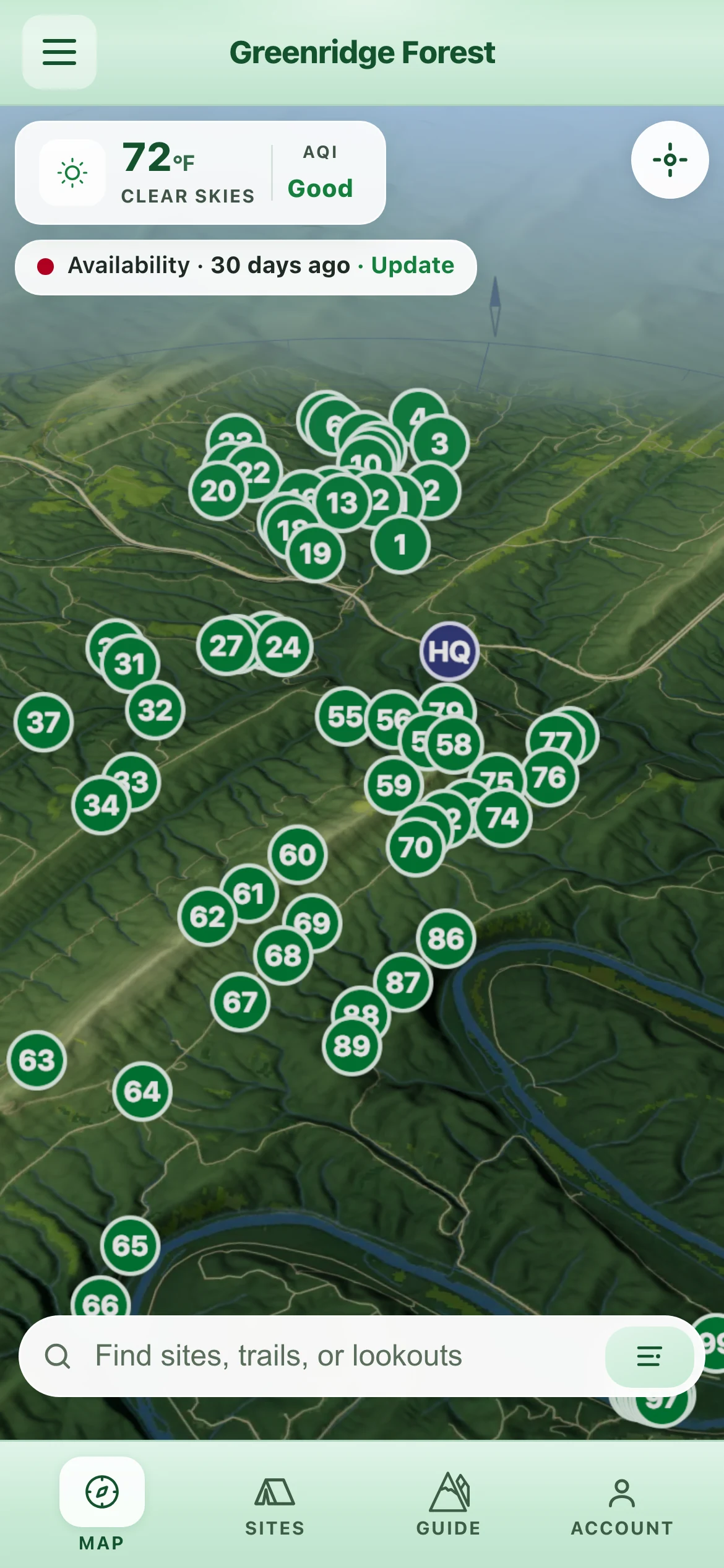
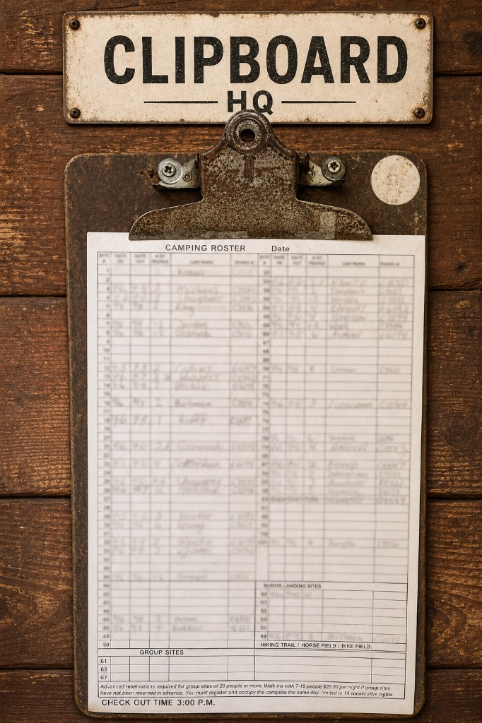
Green Ridge doesn’t expose a reservation API — the Forest Service manages a first-come, first-served signup sheet at headquarters, staffed during limited hours. The operational ground truth lives on that physical board. Campers want planning context (what kind of site is this?) and situational context (what did the board say recently?). A polished “availability” UI that pretends to be authoritative would erode trust faster than no app at all.
Uncertainty is not an edge case in the product. Uncertainty is the product condition. — from the in-repo design process write-up
The design problem became: help people browse and compare sites honestly, surface freshness of clipboard-derived state — including when the last photo is too old to assert open or taken — and make contribution at HQ feel fast and cooperative, not extractive. Always confirm at headquarters; the app shows what’s likely taken before you drive out.
The build wasn’t sequential phases — design, then engineering, then ops. It was concurrent decisions made by the same person. Three choices shaped everything.
The physical signup sheet at HQ didn’t just supply data — it supplied the mental model campers already use on-site. That constraint drove the information architecture more than any wireframe: the grid they reason about at headquarters had to be the grid they see in the live app. Site detail leans the same way — full-bleed photography and traits so a campsite reads as a place, not a row in an inventory table. Any abstraction that lost that fidelity would also lose trust.
Every availability state — fresh, stale, warn, archived — had to be designed twice: once for browsing (map and sites list) and once for contributing (the clipboard flow). Uncertainty is the product condition, so freshness language became first-class chrome: a map chip shows Availability · {age} and nudges “Update” when the HQ photo ages out. Past the warn threshold the product refuses to assert open or taken — preview copy degrades to Availability unknown · last HQ photo… rather than guess wrong. See the states in Storybook and on the live map.
With one person making all calls, coherence doesn’t come from review cycles — it comes from shared primitives. The semantic token system kept the story consistent across map, admin, marketing, and native shells while surviving pivots. Two production-linked showcases share that system: the lightweight design kit is the polished slice (themes side by side); the Storybook workshop is where every component and state lives — including night, the legibility trap. Neither can drift from the app, because both import the real components.
Before the map asks anything of a visitor, the product teaches the loop. A first-run welcome and the in-app Guide — How Greenridge works spell it out in camper language: first-come camping, availability from HQ clipboard photos, contribution that keeps site numbers and stay dates only — never names, and a clear line that the app is not affiliated with Maryland DNR — always confirm at headquarters.
Photography is the refresh mechanism: a camper at HQ captures what’s on the board so everyone else gets a more current picture—without claiming an official reservation.
Two entry points: the in-app update-from-clipboard flow for signed-in users, and the standalone photo-clipboard landing for social/share campaigns—same API host, consistent outcome semantics. The map’s freshness chip deep-links here when the last photo has gone stale.
Field constraints: copy favors “photo” over “scan,” mobile-first layouts, and server-side checks that reinforce trust—e.g. validating image bytes and dimensions, optional EXIF capture date, and an HQ proximity / GPS gate when metadata supports it (skippable paths exist when GPS isn’t present). Those aren’t bureaucratic hurdles; they align contribution with actually being at the board.
Outcomes users see: uploads can become live availability when parsing is confident and dates align; land in pending review when the model or validator is unsure (staff can correct before publish); reject when the image isn’t usable; or join the historic archive when the sheet isn’t current-cycle — the same archive that later teaches seasonal demand for operators.
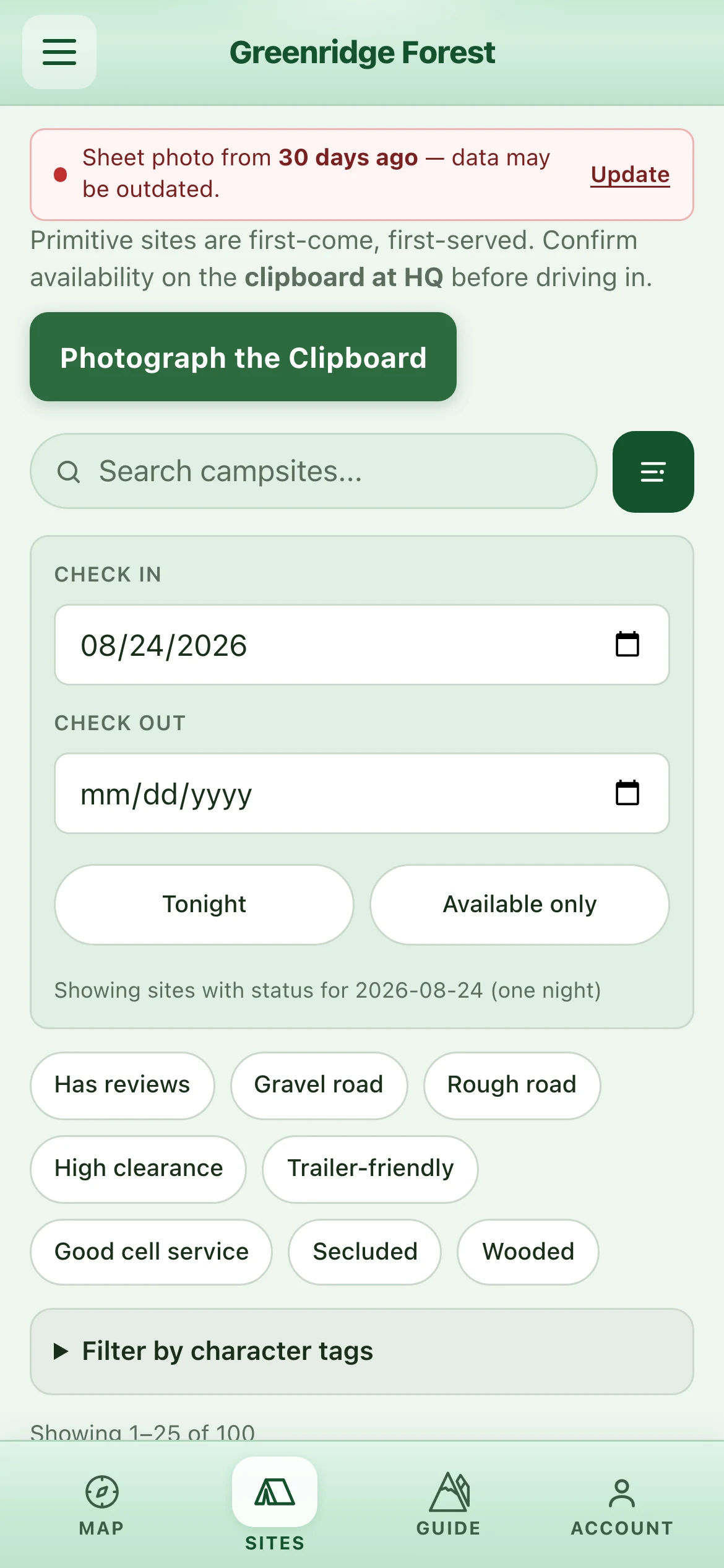
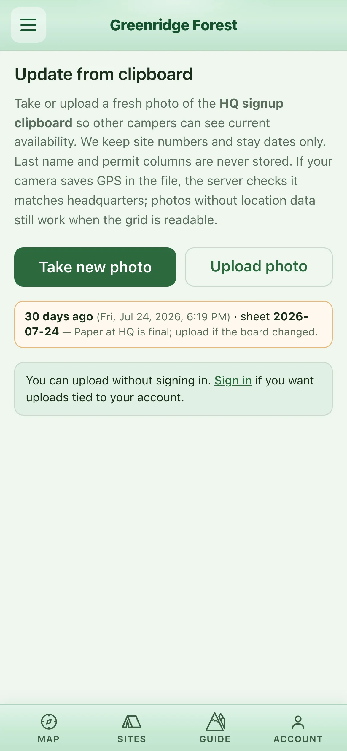
The operational artifact in the field: the product mirrors this object—not a reservation database. Tap the card to open the full clipboard photo flow.
The vision layer doesn’t “guess reservations.” It extracts structured rows from a photo; the server validates JSON, applies privacy rules, and routes uncertain work to humans. Exact model IDs live in server config and can change; the architecture below is stable.
POST /api/sheet; Cognito-linked identity where required.
api/src/server.ts (sheet upload route),
api/src/lib/claude.ts (parseSheetImage),
plus the in-repo clipboard pipeline work plan (stages, env, and ops).
Every admin-validated snapshot is a training signal. Corrections made in the review UI feed directly into re-parse quality and the fine-tuning corpus—no separate annotation workflow.
includeInExports build the corpus. Same production preprocessing applied—model trains on what it sees at inference time.
OPENAI_SHEET_MODEL. No code change to deploy.
api/src/lib/sheetParseFewShotDynamic.ts)
The archive becomes a calendar. Historic clipboard parses also feed an admin booking-patterns view — seasonal density and relative site demand from the same board, framed as a relative guide, not a live forecast. Camper-facing surfaces never pretend that heatmaps are reservations; operators get signal without inventing authority the paper sheet never gave away.
Time-of-day phases remap the same semantic CSS variables on :root — components don’t fork, tokens do. Two design showcases and four product doors all pull from that system so the explorer can’t drift from production. The publish path is part of the product: one web deploy updates the live PWA and every Capacitor shell pointed at production.
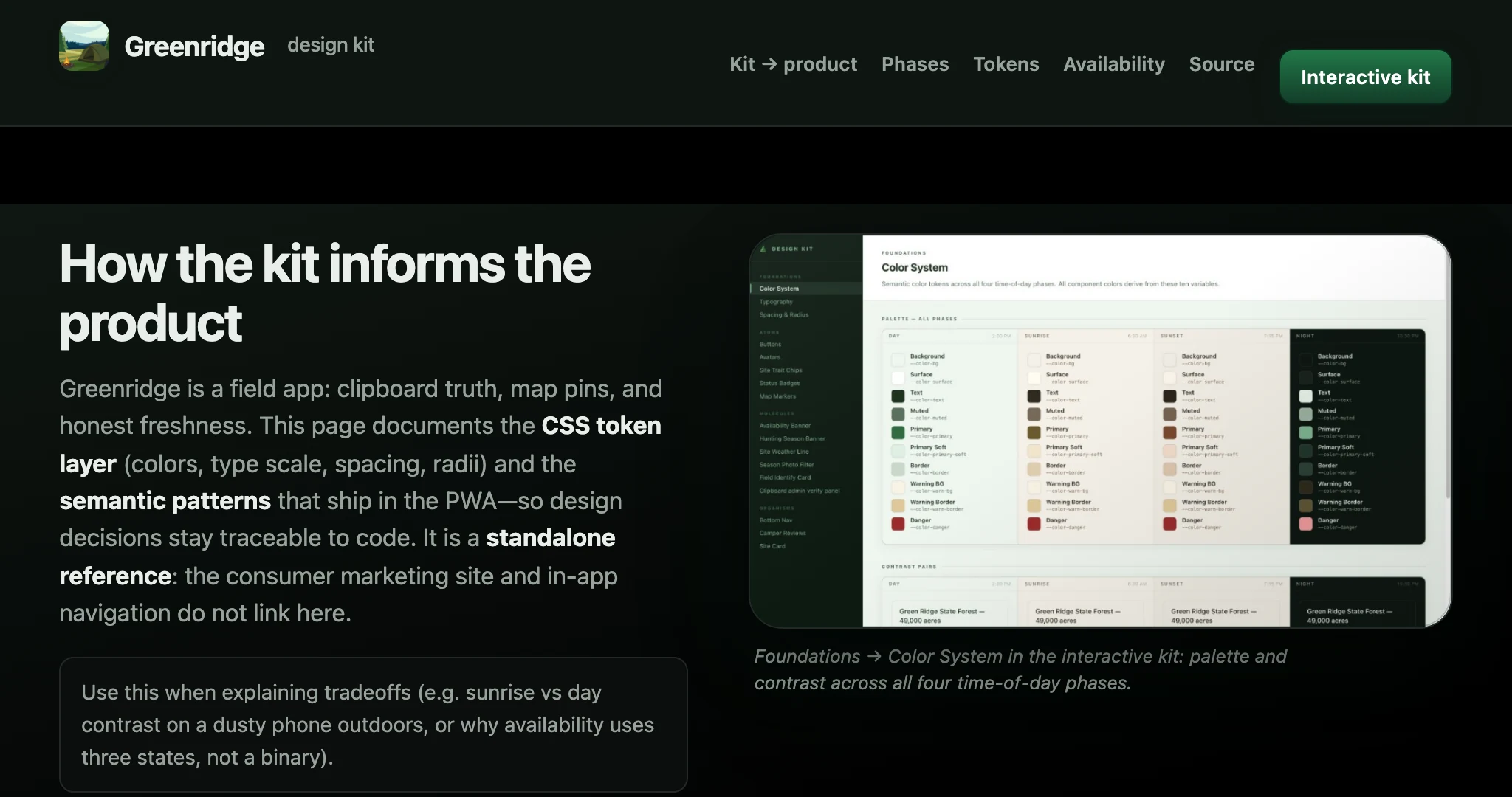
Lightweight kit — curated explorer, themes side by side. Storybook workshop — every component and state (night and auth toolbars included). Both import production components so the explorer can’t drift from the app.
Sheet uploads, vision parse, snapshot lifecycle, admin review, and booking-pattern heatmaps on a Cognito-protected API; Caddy → Node on Lightsail. Pipeline detail under Clipboard pipeline and vision model.
deploy/ README — deploy & server operationsapi/src/server.ts — API entry, routes & middlewareStandalone HTML landing at site root with OG/Twitter cards, hero narrative, and TestFlight interest capture via the same host API. A share-friendly clipboard landing lowers friction for “photograph the sheet” campaigns.
Map with freshness chip, Guide howto, site detail, and clipboard capture. Capacitor shells (TestFlight / Play internal) use a remote-URL model — the store binary is a frame; deploy-web swaps the painting on the server so browser and phone stay in lockstep.
Publish once. Reach both doors. Prove it in a real browser. Continuous delivery here is deliberate: ship the SPA and API to Lightsail, let the PWA and iOS shell reload the same production URL, then run scenario-driven QA with Claude in Chrome — an agent that drives map, freshness, capture, and kit journeys the way a hiring manager or camper would, not a headless screenshot pass.
deploy-web / deploy-api to Lightsail — UI changes land without a new App Store binary.
/greenridge/. Native rebuilds stay for shell polish.
The availability engine taught one discipline above all: name uncertainty, don’t launder it. Two later surfaces carry that past the clipboard.
Sounds of the forest. A first night at Green Ridge is loud in ways newcomers don’t expect — a red fox that screams like a person, the public range carrying on a still morning. A field guide names what you’ll hear, when, and why it’s fine, backed by 60-plus creatures with real Creative-Commons recordings bundled into the app. On the map, a soundshed shows how far the range travels — and it’s deliberately soft-edged: the blur is the honesty. We don’t know exactly how far a shot carries on a given morning, and the fuzzy corridor says so — its reach calibrated from acoustic research and campers’ own reviews. Interstate 68 and the Potomac freight line get their own corridors, so a camper can see which sites hear what.
Location, at the decision moment. The other surface meets the camper where they stand: distance and heading to a site, the nearest trailhead, a quiet “you’re at Site 27” the moment they arrive. It is foreground-only and on-device — a deliberate refusal of background tracking that keeps the quiet-identity posture intact and holds the PWA and the native shell at parity.
Neither needed new infrastructure. Distance reuses the map’s geometry; the soundshed reuses its overlay system; the guide is one data file and a page off the same design tokens. New doors, same house — coherence without handoffs, again.
State where authority lives. Booking stays on the sheet; the app describes last known state and freshness. When the photo is too old, it says unknown instead of guessing.
In uncertain domains, provenance beats polish. Fresh, stale, warn, and archived semantics align map chrome, list, preview, and upload outcomes.
Domain feedback loops beat generic dashboards. Parsed rows, favorites, historic stays, and admin seasonality from the same clipboard corpus answer “is this working?”
Cleanup is design. Renaming flows, trimming chrome, teaching the loop on first run, and fixing mobile keyboards changed trust as much as new features.
AI as collaborator, runtime, and QA. Assistants accelerated shipping; vision parsing makes the analog board legible—within guardrails. Claude in Chrome closes the loop after each deploy against the same URL the iOS shell loads.
Everything worth bookmarking in one place.
docs/user-stories/
deploy/ README · post-deploy Claude in Chrome journeys
Open the live PWA, the marketing story at site root, or the quick clipboard capture flow — same product, different front doors.